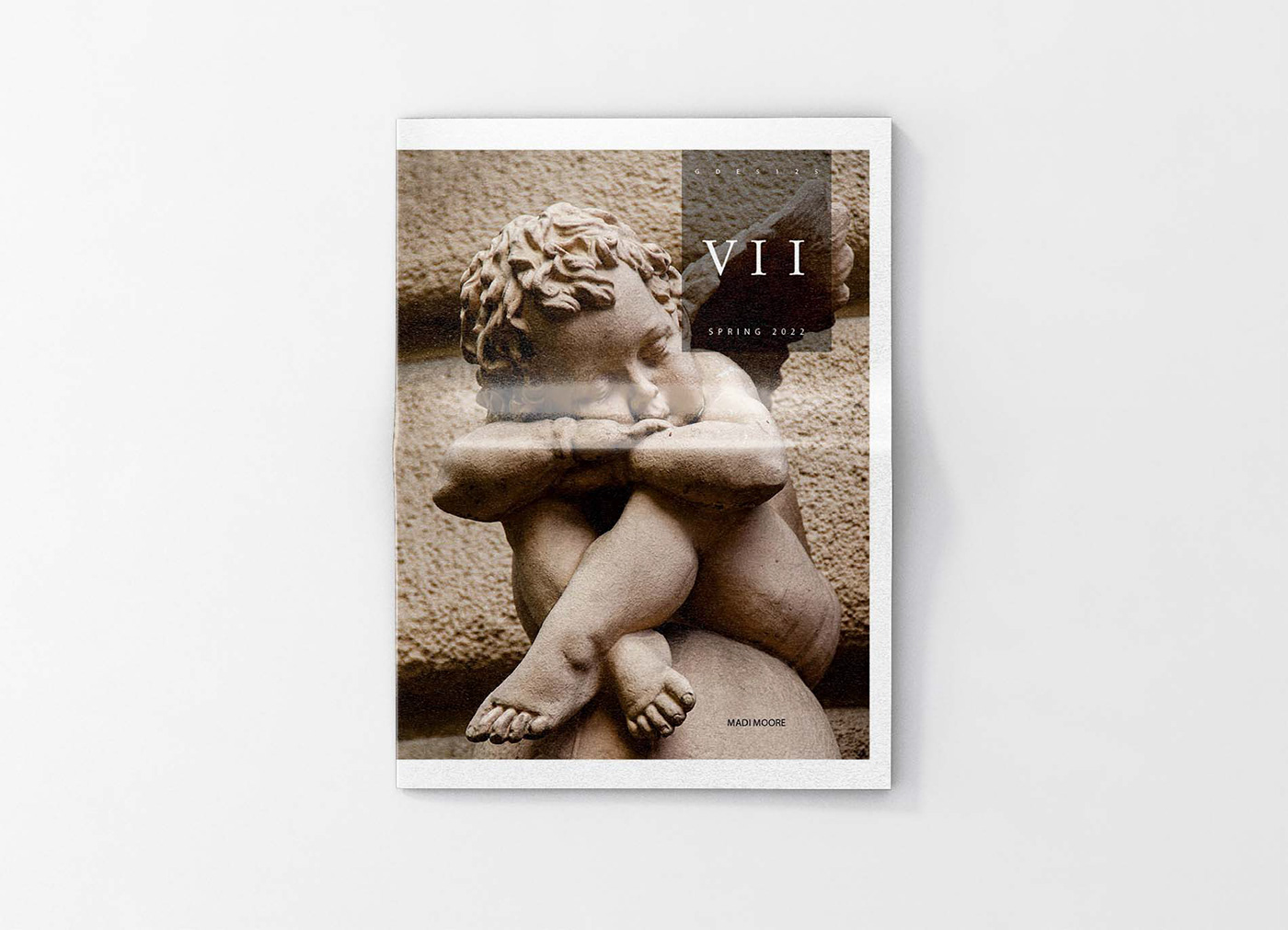
Project 4: Virtues Tabloid
For this project we were required to choose between either the 7 sins or the 7 virtues to create a 20 page tabloid. I chose to do the 7 virtues because I thought the light colors to represent that fit more with my design style and I had more ideas for each of the words. Each page had a specific requirement on how we were supposed to graphically show the meaning of each virtue. We had the tabloid printed out by the Newspaper Club from the UK. This specifically showed us what our print would look like on a 55 gsm paper stock and what it would be like in real life to have to wait on a delivery to have ready by a specific date.
-Page 4 & 5: Analogue Collage- no words or text, full color or B&W
-Page 6 & 7: Letter Forms- full color or B&W
-Page 8 & 9: Personal- full color photo(s) with model
-Page 10 & 11: Personal photo(s)-duotone
-Page 12 & 13: Photographed Object
-Page 14 & 15: Found Photo-full color or B&W- hand lettered text
-Page 16 & 17: Constructed Image- everything in one photo
All text was required to be in whitney sans font.
Click here to take a look at the photos that inspired this project.

This cover photo is a found photo from Unsplash. It is a sculpture of a young child with wings sitting on a round stone. I liked how it was all the same color and makes the cover look simple and calming.

This is my chastity analogue collage. I used photos cut out of a Vogue magazine with some stick on pearls and a dried flower. I wanted to represent this virtue in a clean elegant way. I felt like the color scheme really matched the theme as well as the other elements.

This was to be a photographed object showing patience. I was able to set this desk and chair up in front of my house and used the brick to look like a rustic cafe. I thought the giant cut of steak was a better way of showing extreme patience compared to a couple of treats. I added the pocket watch to show time in a still photo.

This is my constructed image for humility. I hung Atlas's ribbons and medals on a tree in the background to show that they existed but are in the background and not the center of attention. Give the idea that they are "there but...not there". I liked having Atlas on one page and the tree on the other to show a little more separation between the two.


